
sendit.money
scroll down
A Fairer Deal For Africa
A study by the World Bank showed that remittances to nations in Sub-Saharan Africa, amounted $46 billion in 2018, making it the single largest source of external financing within these countries. Despite this, remittance fees remain disproportionately high on the continent, with costs averaging over 10% - a stark contrast when compared against the Sustainable Development Goal (SDG) of just 3%.
Individuals rely on these payments as a lifeline to help pay for everyday essentials, such as food, education and medicine. By charging high fees, current remittance providers are not only reducing the value of money being sent back home by migrant workers but also denying some of the poorest communities in the world the chance to develop and grow in prosperity.
Client: sendit.money
My Role: UX/UI Designer (sole UI designer for final high-fidelity mockups)
Deliverables: Exploratory Research, User Interview Insights, Personas, Wireframes, Mid-High Fidelity Prototypes, Usability Test Results, Visual Style Guide & Design Library
Tools: Figma, Miro, Zoom, Otter.ai, Marvel, Google Forms, sketching, Post-it notes
All illustrations and diagrams throughout this case study are the designer’s own
A Plan To Succeed
Working with a limited timescale for the project we devised a strategy based on Double Diamond and Agile sprint methodologies to ensure our workflow was efficient, target driven and thorough.
The double diamond is not a linear process and encouraged the team to frequently cycle through the stages to iterate and improve on our work.
For the purpose of this case study, I have included aspects of Paper Prototyping testing in the Develop stage and UI Visual Styling in the Deliver stage.

To jump to a section, please select a button below
DISCOVER
Diving In & Learning More
Through extensive Domain Research and Competitive Analysis, the team were able to learn more about the landscape in which the product would be used and uncover key insights and trends that would inform our design approach.
“While South Asians pay an average of US$6 for every $100 they send home, Africans often pay more than twice that”
“The African continent is a frontrunner for mobile money solutions. In 2018, there were 395 million registered mobile money accounts in Sub-Saharan Africa.”
Our user surveys and remote user interviews helped centre our efforts on the people behind the statistics
Security comes first
Security of the transfer was regarded as the most important factor for choosing a remittance provider. Without security; speed, convenience and cost mean nothing.
Convenience vs Cost
Convenience and cost were the next most important factors for users. People prefer to pay less, but if lacking sending or receiving options, convenience takes precedence.
Family at the heart of it all
The primary reason for transfers was to support older family members and provide money for essential items such as food, bills or medicine.
“Why I do that every month is because she has done a lot for me, and she has been there for us”
DEFINE
Meet Our Users...
Drawing on our initial domain research and user interviews, we began work defining our users. We invited our stakeholder to join us in a whiteboard workshop creating the mother and son Proto-Personas of Mary and Emmanuel.
Introducing Emmanuel…
Emmanuel now lives in London, but still supports his mother Mary back in Nigeria.
He’s frustrated by platforms that hide their fees behind exchange rate commissions and needs a service that is simple enough for Mary to sign up to.
Introducing Mary…
Mary’s primary concern when receiving money from Emmanuel is that it is transferred securely. She gets very anxious when waiting for payments to clear.
She wants fast and secure transfers that provide her with a clear payment status.
A Journey For Our Personas
Working with our client to create the personas was a productive start and helped validate assumptions and create a clear idea of who we were designing the product for.
However, we still had to understand the processes involved that allowed sendit.money to transfer funds across borders quickly, securely and at low cost.
I decided that a Service Blueprint workshop with our client would provide the comprehensive overview needed to understand these requirements and how they connect to our users.
We conducted three service blueprints to discover more about:
Signing up for a sendit.money account
Sending money for the first time
Receiving money for the first time

A fuller picture emerges
Sending our personas on a journey through these three tasks not only highlighted where potential pain points could arise for users, but also made clear what the processes were backstage that allowed sendit.money to provide their service.
Proof of identity
Signing up for a sendit.money account has many steps and requires the user to provide a photograph of their ID and a picture of their face.
Different locations, different outcomes
New account holders in the UK are issued an account number and sort code via Visa. New account holders in Africa will need to connect a Verve cash card.
No wallet ID, no transfer
Sendit.money users can only transfer to other sendit.money users via a wallet ID number.
To ensure our solutions meet our user’s needs, we devised the following Design Principles as a guide to all things sendit.money.
Straightforward
Sending remittance packages overseas can be confusing and overwhelming. Sendit.money will break this process down for people and design an application that is simple and easy to use.
Transparent
Current providers often hide the true cost of their service behind hidden charges and unscrupulous exchange fees. Providing transparency of costs and system requests will help sendit.money build confidence and trust with users.
Secure
For many users, remittance packages are an essential lifeline for healthcare and basic living. Accordingly, it is essential that sendit.money designs with security in mind, both in brand image and practice.
DEVELOP


Ideation Time!
With a foundation of understanding, we begin to ideate with Crazy 8 sketches, testing our initial concepts on each other and picking our most viable ideas to put into a paper prototype.
Test fast, to fail fast
Putting our low fidelity paper prototypes to the test with users early on, allows us to get essential early feedback on our user flow and identify points of friction. Selected early insights included:
User feedback is applied directly to the paper screens using Post-it notes. The team then discuss each point in detail, before returning to ideating solutions in time for our wireframes.
1. Length of sign up
Due to the necessary extra security to set up an account, users were finding the process of signing-up long-winded.
A progress bar indicator throughout the signup process would help to keep users on-task and focused.
2. Sell the features to get user buy-in
Lack of information describing the purpose of the app from the landing page meant that users were left unsure as to the value it offered and why they should commit to the sign-up process.
3. Explaining new ideas
A user’s Wallet ID is their unique identifier within the sendit.money system and essential to being able to send funds between sendit.money accounts, however, users were unsure of this significance or exactly how to use it within the product.

Wireframes
In order to collaborate in real time, the team elect to use Figma as our interface design tool. We establish a design system from the outset to maintain consistency and increase our workflow.
Early iteration wireframes of sign-up user flow
New User Sign-Up
To take advantage of the sendit.money platform a user must first open an account to gain access to a personal sendit.money digital wallet.
With our client's help, the Service Blueprint workshop established what requirements would be necessary to open an account and our paper prototypes tested our initial ideas quickly and provided vital early feedback.
However, even after the workshop and our initial lo-fi testing, the extra burden of these sign up requirements still represented one of the biggest design challenges the team had faced.
Users needed a seamless sign up process, that encouraged user-buy-in and maintained our design principles throughout.
Adhering to the principle that the product should be Straightforward, each screen in the signup process gives the user a singular instruction or requirement. This extends the overall screen count, but reduces the cognitive load for the user ands means that the time to complete a single request is reduced and the overall experience much more efficient.
Another way to increase user engagement throughout the process was to look at the copy and it’s tone of voice. Sendit.money seeks to provide a financial product that is different to traditional banking apps, replacing formality with fun. This meant that the language used throughout needed to strike a balance between being friendly and conversational, whilst also providing confidence and trust in its ability to deliver security.

What's a Wallet ID?
Our service blueprint highlighted the importance of the Wallet ID in allowing users to send money through the platform.
When a new user signs up for a sendit.money account, they are assigned a unique and immutable Wallet ID number. This number acts much like a traditional bank account number and provides the digital address to which funds can be sent.
A key challenge raised in our early paper prototype testing, was how best to communicate the wallet ID to users and how to build a mental model that inspired confidence in sharing this number with other users.
The team ideated various concepts and picked 3 divergent ideas (below) to test on 21 users.
Early sketched ideas
Wallet ID Concept 1
Concept 1
The least intuitive of the concepts with only 19% of users voting it their favourite.
The ID number situated on the top left of the card made it less prominent on the screen and the “i” icon did not communicate that the number could be shared without further investigation.
Wallet ID Concept 2
Concept 2
Was considered by 29% of users as the most direct solution.
The Wallet ID button is prominent on the screen but does not hint that it can be shared without navigating to the following screen.
Wallet ID Concept 3
Concept 3
The most popular concept in testing with 52% of users voting it their favourite and most intuitive.
Placement of the ID lower on the card kept the information prominent and within the thumb-zone for easier access. The iconography was considered more appropriate for the function it allowed too.
However, the share icon was also confused by some to be an upload button. A good example of the problems that can occur when icons are without labels.
Moving forward
Scrutinising an individual feature such as this also highlighted other shortcomings in our solution.
For example labeling the number “ID” on the card (as in concepts 1 & 3), then proceeding to describe the function of the “Wallet ID” in the following overlay, we had failed to remain consistent in our labelling and reduced our capacity to build a mental model for our users.
After careful deliberation, we decided to describe this component as the “sendit.money ID”. Thereby raising it’s status within the product and aligning it more closely with the brand.
DELIVER

Usability Testing
With the changes applied to our wireframes and a prototype created, we utilised the Nielsen Norman Group principle that 5 users will be able to highlight 85% of usability problems and set about recruiting suitable participants and recording the results.
Each participant was asked to complete the following 4 tasks:
Task 1 - Create an account with the app
Task 2 - Add funds to the app
Task 3 - Make a transfer to another user
Task 4 - Share account details
The Results
Our iterated prototype performed well with all 5 users, scoring 100% task completion across all tasks set.
Our usability test recorded the time it took participants to complete a task, and also a difficulty rating provided by the user at the end of each task.
This quantitative data helped us evaluate how efficient the user flow was and provided the product with useful benchmarking metrics to assess future improvements.
Despite the encouraging quantitative data, the qualitative data from users comments and behaviour recorded during each test showed which areas required further development…
Add funds to app usability issues
Add Funds to the App
To add funds to the app a user must first input the amount they wish to add and then select a method of transfer into their sendit.money account.
However, our usability test highlighted some omissions from our user flow that created hesitation from users:
• Requiring the user to select either credit or debit card is unnecessary as the system charges the same fee for both.
• The top-up screens do not remind the user of the amount to be added beyond the initial input field. In keeping with our design principle, we need to be transparent and show the amount being added and fees payable throughout this task.
Sending money usability issues
Making a Transfer to Another User
Sending money is what sendit.money is all about - so for our users to report that this task was the most difficult to complete meant we really needed to investigate further to deliver an effective MVP.
• Users found the look and feel of screen 2 lacking in the kind of information they would expect to see (such as exchange rates and fees payable). This made it difficult for them to make an informed decision and resulted in hesitation.

User Interface Design

Style Tile
Early Style Tile for product UI
From the project’s outset, our client explained that fintech products had attempted to break into the African continent before and failed. The reason why? They did not understand the African markets and did not reflect the people they were there to serve.
The UI of sendit.money is the perfect opportunity to convey this understanding to the user. My initial Style Tile took inspiration from contemporary African culture and the flags of the markets sendit.money will serve.
Selected stages of development
My initial ideas for the UI involved utilising bold colours, organic button shapes and striking geometric African patterns to create a distinct visual identity.
However, these early designs left components competing for attention and, in turn, reduced usability.
Through experimentation and many iterations, I found the most successful UI to have a softer colour palette coupled with more white space. This maintains the bold look, but offers a clearer interface, encouraging the user to engage with the product confidently but without distraction.

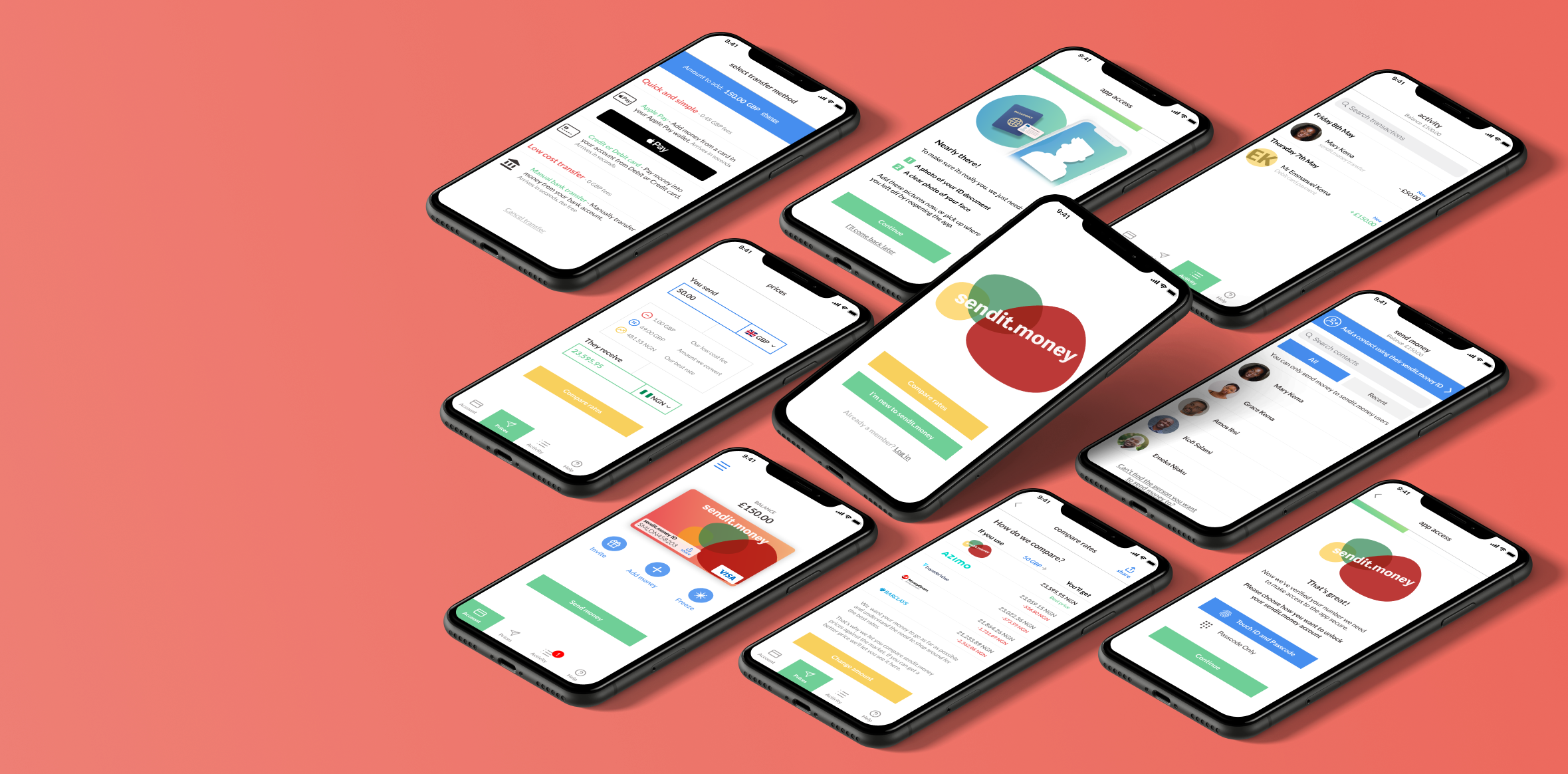
Final Screens
New User Sign Up


Add Money


Send Money


Try the clickable prototype HERE
Signing-up
To take advantage of the sendit.money platform a user needs to sign-up for an account. To ensure the service remains secure, new users are required to verify their identity and provide a photo of an ID document.
A challenge the team faced throughout was ensuring this process remained straightforward, efficient and successful in keeping the user motivated to to finish the task at hand.
Numerous iterations and usability feedback helped structure the process and refine the most effective way to achieve this.
Sendit.money ID & Add Money
As the key to low-cost and quick money transfers, sharing the sendit.money ID had to be simple and intuitive. Our concept testing showed us what users expected and the importance of remaining consistent in our labelling to successfully build a mental model.
Another necessary step in order to transfer through the platform, was for the user to add money to their account. Sendit.money gives multiple options to achieve this, from using Apple Pay or making a credit or debit card payment for a small fee or providing the user with the account details in which a bank transfer can be sent free of charge.
Sending Money
A user’s account is set-up through their mobile phone and registered to their telephone number. Because of this, other sendit.money users in an account holder’s contact book automatically appear in the list of available recipients. The profile picture is the one verified against their ID at account sign-up to help with identification and reduce the risk of fraud.
If a recipient is not in the account holder’s contacts, they can be manually added via their sendit.money ID.
Confirming transfers with a passcode helps avoid accidental or spurious transactions and the progress animation provides the necessary system status to show that money has been sent.
Reflections & Next Steps…
At the end of the 4 weeks developing the sendit.money prototype, the team had successfully delivered an MVP that provided solutions to the problems faced by Emmanuel and Mary.
Setting clear expectations, choosing target-driven workshops and managing our sprints effectively, meant that the end result delivered on it’s promise and left our client very happy and in a position to develop the product and business further.
I learnt a lot about how remittance platforms work and the security requirements needed to successfully sign-up a new user to a fintech product.
Next steps and potential beta release features include:
Developing the user flow of a person receiving money for the first time.
Exploring how existing users invite new users to the platform.
How a user freezes their sendit.money account if suspicious activity is detected.
Exploring the possibility of naming an account “guardian” that can freeze the account of a relative/friend in the event of suspicious activity.
For African users, linking a Verve cash card and monitoring activity through the app.
Receiving money first steps